Page 1 of 8 123 ... LastLast
Results 1 to 10 of 76

Thread: Club Emblem/logo

Hybrid View

Previous Post Previous Post   Next Post Next Post
  1. #1
    Moderator Alien DNA's Avatar
    Join Date
    Jun 2010
    Location
    Melbourne, Australia
    Posts
    3,315

    Club Emblem/logo

    Hey guys!!

    Its time you get your crayons and photoshop skills in action!! Not the most important item on the agenda, but will need to be figured out none the less.

    Before you say anything, my artistic skills are sheet......so dont point out the obvious ...but the good lady wife kicks all kinds of arse with photoshop...so crayola drawings can be converted to look professional. Even Blocker is quite switched on with also.

    What do you want the club emblem to look like? Classy...cool....smart....clean....obscure ???? Now bear in mind, when it is shrunk down to a small size detail wont work...particularly when it comes to embroidering on a shirt or cap.

    Include whatever you want...surfboards....sun...surf ....etc etc

    So here are a few examples.....and it would be great if everyone could come up with 2 or 3 designs they like and share them with the team. Likely there will be ideas from various designs we can roll into one design.

    So lets see what you got....start drawing/sketching/painting...whatrever your medium
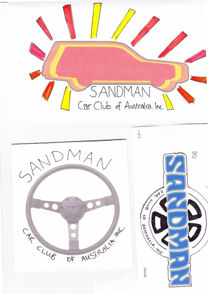
    Last edited by Alien DNA; 26-02-2015 at 12:03 AM.

  2. #2
    Administrator Jeza's Avatar
    Join Date
    Feb 2010
    Location
    Geelong, but ex-Sandgroper
    Posts
    240
    I too am sh1t when it comes to art/design.... Will we be allowed to use the sandman logo? There are both the HQ/J style and the HX/HZ style. I like both but do prefer the later, and it is the most recognised.

    What about the lettering logo with the rainbow style colours like in the early Rip Curl logo from the same era - Red, yellow, green and blue evenly spaced horizontally through the lettering. Could even be a little more creative and make the colours factory ones - say mandarin red, chrome yellow, lime green (memory lapse, can't think of the colour and I had one) and deauville or Windsor blue?

  3. #3
    Moderator Alien DNA's Avatar
    Join Date
    Jun 2010
    Location
    Melbourne, Australia
    Posts
    3,315
    Fairly sure Blocker says we can use the logo....he'll get permission in writing.

    Mate, just go with the flow and have a shot....winning design will be finished to a really high standard with photoshop. We just need a bunch of designs/ideas to pick from. The more designs, the better the final emblem will be

  4. #4
    Administrator Jeza's Avatar
    Join Date
    Feb 2010
    Location
    Geelong, but ex-Sandgroper
    Posts
    240
    Righto Ivan, here goes - ruff as guts!! Photocopied, colour pencilled and then photo taken

    Sandman Club logo 3.JPG

  5. #5
    Leadfoot jbsandman76's Avatar
    Join Date
    Feb 2010
    Location
    Clyde North VIC
    Posts
    134
    Quote Originally Posted by Jeza View Post
    Righto Ivan, here goes - ruff as guts!! Photocopied, colour pencilled and then photo taken

    Sandman Club logo 3.JPG
    That looks awesome Jeza. I really like that.

  6. #6
    Moderator Alien DNA's Avatar
    Join Date
    Jun 2010
    Location
    Melbourne, Australia
    Posts
    3,315
    Bloody hell...thats better than my effort

    I like it...keep the ideas coming

  7. #7
    Night Rider Blocker's Avatar
    Join Date
    Feb 2010
    Location
    Behind the keyboard.
    Posts
    3,166
    I went for something simple as well, so that printing or embroidery costs are kept low.
    Silver GM Lion on 5 rings which represent a sunset but also represents each of the 5 'Offical' Sandman models (HQ, HJ, HX, HZ & VF) The outer grey is silver same as the lion.

    The logo beneath is interchangeable depending on which State or chapter is being represented.
    Capture.PNG

  8. #8
    Administrator Jeza's Avatar
    Join Date
    Feb 2010
    Location
    Geelong, but ex-Sandgroper
    Posts
    240
    [QUOTE=Blocker;91521]I went for something simple as well, so that printing or embroidery costs are kept low.
    Silver GM Lion on 5 rings which represent a sunset but also represents each of the 5 'Offical' Sandman models (HQ, HJ, HX, HZ & VF) The outer grey is silver same as the lion.

    The logo beneath is interchangeable depending on which State or chapter is being represented.


    I've been having another play with this - from what I understand, keeping the logo to 3 colours is going to be more cost effective for printing and production, and also keeping it pretty basic so that it can be used in smaller sizes and doesn't get too distorted. In my opinion, the semi-circle representing a sunset looks good, I can understand the thought of the five official models - but will there be another after the VF?? Sometimes less is more in the detail. To me if we are to use an image it should be something more specific to the Sandman. So I've opted for the Van image that Ivan had on one of his logos and adapted a ute into the image as well (very rough). If we were to be more embracing of the new VF model - we could include a wagon in this as well? But I'm not sure that this is necessary?? Another option would be to represent the VF with the 3 colours in logo that its being released in - Silver, black and white?? - not so sure about that....

    So I've pinched a I pinched a bit from Blockers and a bit of Ivans. Again this is very amateurish, and needs a lot of tweaking but you'll get the idea. The vehicle images should represent the actual colours and I reckon the van should be the red and the ute yellow, this would make the van image more prominent. When it comes to the detail, the van could be HJ/X/Z shape and the ute could be a Q? I like the HX/Z lettering for the name - I reckon this is the most recognisable in the Sandman. Having said that the HQ/J Sandman lettering also looks really cool under this logo.

    I reckon the Sandman lettering could have the three colours equally solidly filled through as well - that would look pretty cool but I don't know how to do that other than manually colouring it in.

    One other thing, on a different note - is 'Car' required in the title Sandman Car Club of Australia? Could it just be Sandman Club of Australia?? I don't think that Sandman Club could mean anything else other than a car club in Australia - kind of like having the Macca's title of McDonalds 'Hamburgers' if you know what I mean?

    Anyhow, I hope I'm not upsetting anyone with the suggestions. I'm not precious about my ideas and welcome and look forward to everybody's feedback.

    Cheers,

    Jez

    Sandman Club Logo - March 15th Jez 2.pdf

  9. #9
    Moderator Alien DNA's Avatar
    Join Date
    Jun 2010
    Location
    Melbourne, Australia
    Posts
    3,315
    Bloody hell.... That's pretty cool

  10. #10
    Night Rider Blocker's Avatar
    Join Date
    Feb 2010
    Location
    Behind the keyboard.
    Posts
    3,166
    Quote Originally Posted by Alien DNA View Post
    Bloody hell.... That's pretty cool
    Thanks.
    If printed on a dark shirt or banner the text would be in silver I think to keep it at 3 colour printing.

Thread Information

Users Browsing this Thread

There are currently 1 users browsing this thread. (0 members and 1 guests)

Similar Threads

  1. Is mysandman a club?
    By april_eighteen in forum Off Topic Discussions
    Replies: 39
    Last Post: 15-01-2015, 06:55 PM
  2. Sandman logo in DXF format for steel sign
    By damienengland in forum The Lounge
    Replies: 13
    Last Post: 02-11-2014, 10:20 PM
  3. Replies: 9
    Last Post: 22-01-2013, 12:15 AM
  4. Seatbelt Logo
    By hj308 in forum Interior
    Replies: 4
    Last Post: 02-06-2012, 06:49 PM
  5. Replies: 7
    Last Post: 04-06-2010, 09:58 PM

Bookmarks

Posting Permissions

  • You may not post new threads
  • You may not post replies
  • You may not post attachments
  • You may not edit your posts
  •